
2670: Morse Code Codes Apr 9, 2022
Other than Q-codes, along with the less common Z-codes and X-codes, Morse code uses lots of standard abbreviations. Some of these will be linked to the words they abbreviate, like BN (all between); C (correct) or FWD (forward) to name a few, plenty of others are simply usefully short, like CQD (All stations distress) or K (invitation to transmit) but have no relation to the meaning. Others still use a combination, like WX (weather) or even just use numbers 73 (best regards). These sorts of official codes were accompanied by many more unofficial codes to speed up communication.
2668: International Telecommunication Union (ITU) Standard Apr 7, 2022
Morse code was changed a number of times, finally cemented in 1865 with the International Telecommunication Union standard. This was mostly based on Morse's original system, as well as Gerke's modified European version, but some letters were redesigned wholesale like those for <O> (once • • with a medial pause, to later – – –) and <P> (once • • • • •, later • – – •). It also distinguished <I> and <J> that Gerke's system had as the same (• • without the medial pause), though it does not use Morse's original <J> (– • – •) because this was instead used for <C>.
This left only 4 characters unchanged since the original system. Per letter this did actually make things longer to spell & therefore become on the surface less efficient, but it led to a greater ease of understanding that would cancel that out. It has little resemblance to the original Morse code, but many still call it as such, even though the technical name would be the International Telecommunication Union (ITU) standard.
2667: International Morse Code Apr 6, 2022
There were lots of innovations that helped to spread Morse code, such as moving from paper to sound which speeds up comprehension and the switch from cables to radio waves, which originally could not transmit voices. Beyond that however, the real driver for the system's success was its early, wide adoption, such as at the 1851 Vienna conference which made it standard for many Central European countries, and even earlier when it was adopted among American railroads—eventually adopted broadly in America—in the two decades preceding the Civil War. That said, International Morse code (made by Friedrich Gerke) is different to American Morse code, and was influenced by the system already in place with the Hamburg railways. This standardized the length of dashes, which were somewhat variable in American Morse code, as well as adding in special characters not used for English.
2662: 3 Names for Z Apr 1, 2022
The letter Z in America is called 'zee' and basically everywhere else in the anglophone world, 'zed'. There is a third version though, widely used nowhere, called 'izzard', though this was somewhat more popular in the 18th century. Unlike the other two which either follows the pattern of other letters 'cee; dee; tee' or following the Greek zeta. Instead, this form probably comes from the French 'ézed', though the word now is ‘zède‘.
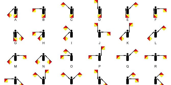
2661: Japanese Semaphore Mar 31, 2022
Things like semaphore and morse code word for alphabetic systems like the Latin alphabet, but it might not be obvious how Japanese writing might be adapted for it. Japanese semaphore for instance had to rethink the concept since there are about twice the number of characters compared to the Latin alphabet, and it is a syllabary. Instead, with a red flag in the right hand and white in the left, they had the semaphore signals roughly match the trajectory of how the strokes look in the characters but this would usually take two or more different motions complete. Semaphore already rotated the flags like the hands of a clock to sign letters and numbers with the same displays, owing to its clock-like mechanical origins, but Japanese semaphore had a different system for numbers to its letters.
2660: Origins of Semaphore Mar 30, 2022
Although the idea of having a system of flag-signals to represent letters for use on ships or other long-distance scenarios might seem both vital and basic, the modern semaphore system only came about in 1866. This followed the telegraph system and the optical telegraph. While the optical telegraph was useful for shore-to-ship signalling as it was a large structure and could use long mechanical arms to do so, but on ships this was impractical so people signalled with their hands, often holding flags for visual clarity. That said, by the time semaphore was introduced formally, the optical telegraph was out of use, replaced with the electric telegraph.
2659: Optical Telegraph Mar 29, 2022
Before the advent of radio, and even the electric telegraph, there was still a need to transmit specific messages short-distance, especially without the use of cables. This was particularly needed with ships, and while a lighthouse can be useful sometimes, another machine called the optical telegraph was invented. At night, a so-called shutter telegraph use panels to precisely block light in order to transmit a message in code, but during the day, semaphore telegraphs would use long mechanical arms to indicate the different letters. Some could be used to transmit messages up to 20 miles with a telescope and good weather conditions, not only to ships but to other relaying post towers. These machines were not in use very long, but they did inspire the use of other developments that followed shortly.
2658: Manual or Automatic Kerning Mar 28, 2022
Most computer programs will include features for kerning, i.e. adjusting the spacing of a print, but these may not always be as fitting as manual kerning. Computers can kern words and pages quickly and efficiently, but given how contextual this spacing may be, it may result in a visual effect that looks jarring. There are also problems of overkerning, where some letters in a word will slot together neatly, like <AV> but then the surrounding letters will not causing the word to look awkwardly spaced. If the <AVA> in the word <BRAVADO> would be set too close for instance, this would look jarring to a reading as if it's three distinct words, but without any kerning the center would look too spaced apart. Computers have a hard time recognizing what is more or less difficult to read so for expert detail, it is still often preferable to have a person behind the printing design.
2657: Problems with Kerning Computer Programs Mar 27, 2022
Kerning, the process of more deliberately spacing prints, as it related to the spacing of individual letters, can be fraught with difficulty when it is based on programs. While this helps to save space and make things look neater given that letters are not always of the same width, height etc., it can also cause issues. For instance, punctuation is notably difficult, especially when the letter has a section above the x-height that carries over to the right, like F, P, T, V, W, and Y. Many computer programs for lots of different fonts will kern the period <.> such that if fits underneath, but if there are other punctuation marks after, like <."> then these might end up overlapping with the letter due to oversight in the coded program.
2656: Kerning: The Basics Mar 26, 2022
Kerning is the process of tweaking the spacing and proportion of the individual letters in a proportional font for printing, meaning that the letters are not all uniformly sized and spaced, such as a typewriter font. There are multiple ways to do kerning, including only adjusting the spacing between pairs of letters, or looking at a text more globally to fit things neatly on full lines. As a result, there is over- and under-kerning, where the letter sets will either be too close together or too spaced apart. Before digital typing, the process of kerning on a printing press was arduous, but there are certain letter pairs, like AV most famously, that were usually kerned to not look so far apart. After digital word processors became more common, many fonts would be programed to adjust spacing for many more combinations.
2654: Lingering Traces of Long S Mar 24, 2022
While usage of the long s ⟨ſ⟩ declined sharply after the start of the 19th century, but it did not totally disappear. First of all, it was used in the alphabets as its own letter—that is, not as a variant of 'S'—such as in various writing systems of Slavic and Caucasian languages even into the early 20th century; Turkmen used it for its Latin script as its own letter before that was replaced with 'ž'. Moreover, it is still found as a ligature making up the German ß (sz) though this has long been considered its own letter.
Moreover, outside of specific writing systems, it was the symbol of the shiling when that was part of British currency, though this has largely been replaced with a / symbol. ⟨ſ⟩ is used in mathematics for integrals, though this is a stylized form based on the italicised version /ʃ/, hence the tail at the end and no x-height nub. In the International Phonetic alphabet, the same italicised version /ʃ/ is used to represent the first found in 'SHort'.
2652: Style & Nub of the Long S
The long s ⟨ſ⟩ has a nub on the left side of it when typed. This is a lingering tradition from the blackletter typeface. While this nub likely made it easier to space for printing, it did make it more easily confused for the letter ⟨f⟩. The reason for the nub was not only stylistic though, aside from Italic fonts where it wasn't present, it alleviated the need to employ kerning. Kerning is the process of adjusting the spacing of letters when they would be bound to overlap or be too far apart when uniform, and there will be more on this topic here at a later date.
2651: Long S Rules Mar 21, 2022
In printing, as well as handwriting since the time of the Romans, there was a so-called 'long s' which appeared ⟨ſ⟩. This was not a random variant or a font of ⟨s⟩, but has its own rules about when it is used instead. In the 17th & 18th centuries, these were the standards for printing
• Round S ⟨s⟩ was always used before ⟨f⟩, before apostrophes, and at the ends of words.
•Long S ⟨ſ⟩ was always used in the beginning or middle including when the word was broken up with hyphens or abbreviated.
• If there were two successive S's, the first would be long and the last would be round. Some letters were known to usually be preceded by a long or round s, like ⟨b⟩ that usually has a round s.
2650: Long S Mar 20, 2022
There is something called the long s ⟨ſ⟩, which people may be familiar with from printed documents before the 19th century especially. This is often confused with an ⟨f⟩ on first glance, but the two are unrelated. The long s, distinguished from the 'round s', dates back to Roman times at the time the upper & lower case letters were being distinguished, but before there were clear rules about them. The Greek sigma also is unique in the Greek alphabet for having three forms, and represents broadly the same sound, but that's not related. This was later formalized in German printing especially. After the start of the 18th century, it became phased out as it was harder for typists, required an extra letter in print types, and was not seen as providing enough benefit to account for the extra work. There will be more on the form & history of the long s in coming posts.
2639: Ladino Use for Solitario (Extra Hebrew Diacritics) Mar 9, 2022
Solitario and Rashi script uses diacritics for sounds not represented in a script normally intended for Hebrew. This is also the case in modern Hebrew writing, but not as much in Yiddish, which used digraphs etc., possible inspired by German which has many of the same. Presently, Hebrew only has one digraph, which is נג <ng> like it is found in English, German, and Yiddish for the [ŋ] sound. In Solitario used for Ladino, this was not the convention, and diacritics were added to letters. For instance, the [dʒ] sound in the word 'Jump' or 'Giraffe' is written ג׳ or גﬞ from the basic ג [g], but in Yiddish this is written -דזש <dzsh>. The only similarity between Ladino and Yiddish conventions when it comes to non-Hebrew sounds is that Yiddish also used פֿ to represent [f] as opposed to [p].
Overall, not including the ones used in Biblical Hebrew (of which there would be an additional 5), Solitario used the added forms:
זﬞ for [ʒ] (like 'viSion' or French 'Je')
טﬞ for [θ] as in 'THree'
גﬞ for [dʒ] as in Jump
2638: Solitario Script Mar 8, 2022
For all Hebrew handwriting, it does not look like printed Hebrew exactly but uses its own modern semi cursive handwriting. Like Rashi script, Solitario was a Sephardic semi cursive font used for Spanish, Ladino, and Arabic around the Mediterranean. Unlike the Ashkenazi script which grew out of it in many ways, there are more ligatures (i.e. letters joined together), and there were more diacritics used for sounds not represented in a script normally intended for Hebrew. It is also the ancestor of the modern Israeli Hebrew script, though one could not read Solitario immediately if he only knew modern Hebrew cursive.

2637: Rashi Script Mar 7, 2022
Rashi, perhaps the most famous Jewish biblical commentator, is known for being printed in a font called Rashi script, though he did not write in it himself. For one thing, it was used about four centuries after he wrote, and it is a Sephardic semi-cursive script; Rashi was not Sephardic. A tradition developed where all primary scriptural texts were written in traditional Hebrew block-letters, and all secondary texts like commentaries were in script font. This was eventually standardized into Rashi script, which is still used for many commentaries and translations.
2563: Boustrophedon Dec 19, 2021
Boustrophedon is a style of writing, theoretically in any linear script, wherein the direction of the writing on each line alternates. This will mean in Greek for example the first line will be right-to-left and the next line will be left-to-write. It can be done with the letters rotating on the horizontal- or vertical axis. This practice was done relatively commonly in the ancient world and many clay tablets exist from Greece and the surrounding areas especially with those styles in place. 'Boustrophedon' anyway takes its name from Greek meaning 'turning bull'.
2539: Cypro-Minoan Syllabary: Linear C Nov 25, 2021
Early forms of Greek used their own early forms of writing known as Linear A and Linear B. At one point the term "Linear C" was in use, though that has now basically been usurped by "Cypro-Minoan syllabary". This was, too, used for what has been deduced as an early variety of Greek, with most inscriptions in this writing system found on the island of Cyprus with others found one location of the Syrian coast. This was brought by Minoan settlers from Crete. Although this early writing had existed in its evolved forms for at least 14 centuries from the creation of Linear A to the decline of its final descendants, these characters did not survive.
2538: Cypriot Syllabary Nov 24, 2021
The Republic of Cyprus is the only other country to officially use the Greek alphabet, but in the ancient world it had its own writing system for its particular dialect of Greek. Developed from the Cypro-Minoan syllabary, the Cypriot syllabary is a unique system, unrelated to the later Greek alphabet or its predecessors. The oldest known inscriptions were found from about 1500BC and other fragments indicate it was in use nearly a millennium later. Eventually, this would be replaced by foreign systems and end that particular chain of writing systems descended from Linear A.